Barista Valet: See What’s Brewing
A mobile app redesign to support a growing business model, product catalog, and an overall improved user experience.
Project Overview
Barista Valet, a subscription coffee delivery service in the NYC-area, contracted our team to do a redesign of their existing mobile app, which their customers use to manage their orders.
Through user research we identified a few key opportunities for improvement in the app. Designing into these opportunities, we were able to increase users’ ability to complete 4 common tasks in the app.
My role: Product Designer
Duration: 3 Weeks
Project Status: Complete, May 2022
Methods used: Business Model Canvas, Competitive & Comparative Feature Analysis, Customer Survey Analysis, User Interviews, Affinity Mapping, User Persona, User Journey, Service Blueprint, Feature Prioritization, Sketching & Design Studio, Wireframing, Prototyping, & Usability Testing
Introduction to Barista Valet
Barista Valet is a B2C subscription-based coffee delivery service, delivering freshly brewed coffee to residential lobbies in the NYC-area. They feature different partnered roasters weekly, and customers set a weekly recurring order for delivery up to 5 days a week (Monday-Friday) as part of their subscription plan.
The Challenge
Barista Valet recently expanded to offer additional drinks and a selection of food items, which will be an “add-on,” or an additional cost, to the users’ existing subscription. These will be available as one-off purchases, as well as part of recurring weekly orders.
Barista Valet needed a redesign of their app to accommodate these new product offerings and elevate the overall service experience to combat user churn.
Additional Considerations
There were a few other areas the founders wanted us to touch on in our designs — ensuring users can find the Roaster of the Week, finding ways to get customers’ feedback on their products, and increasing stickiness with the service by adding a sense of community.
Our Solution
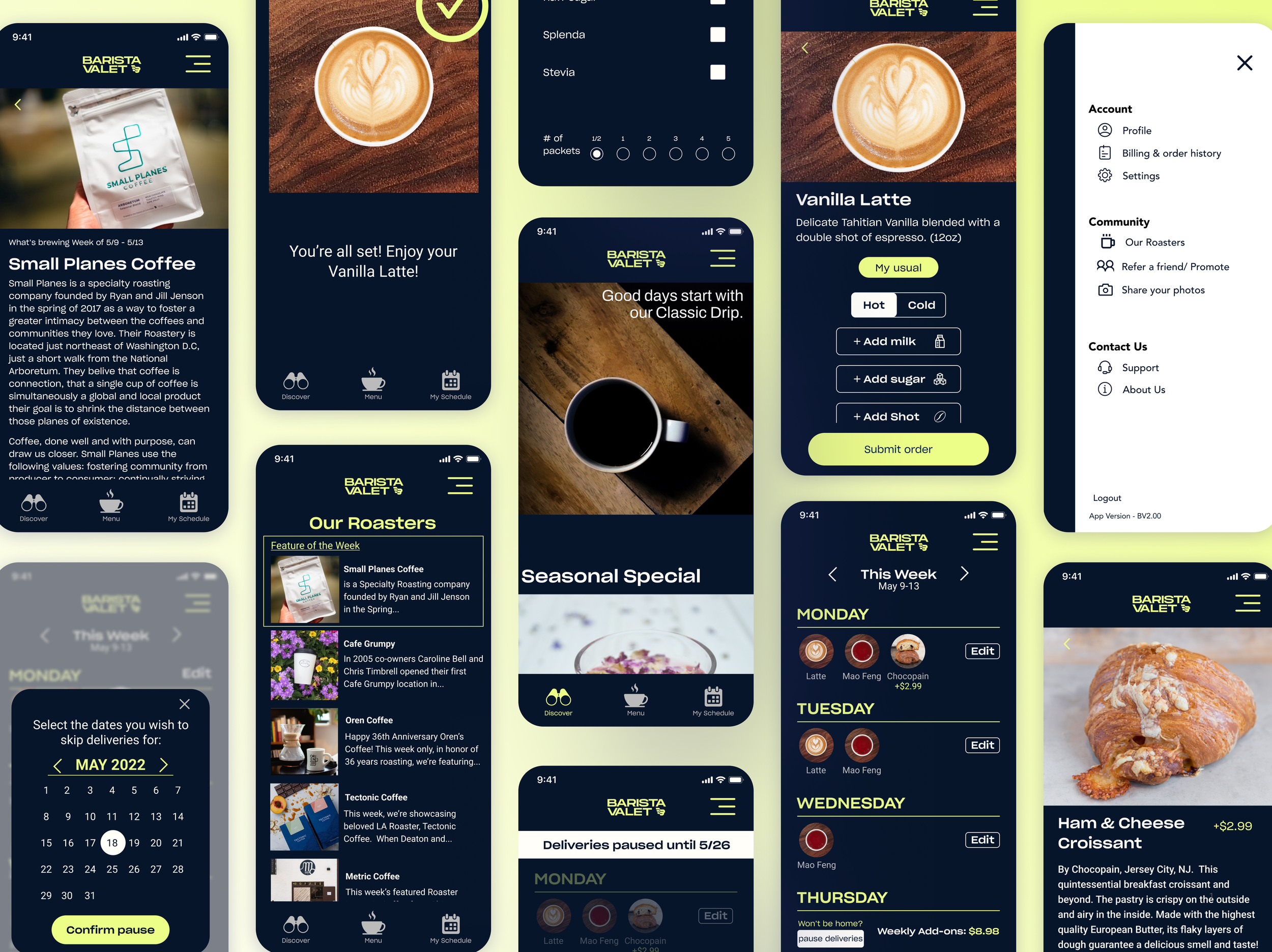
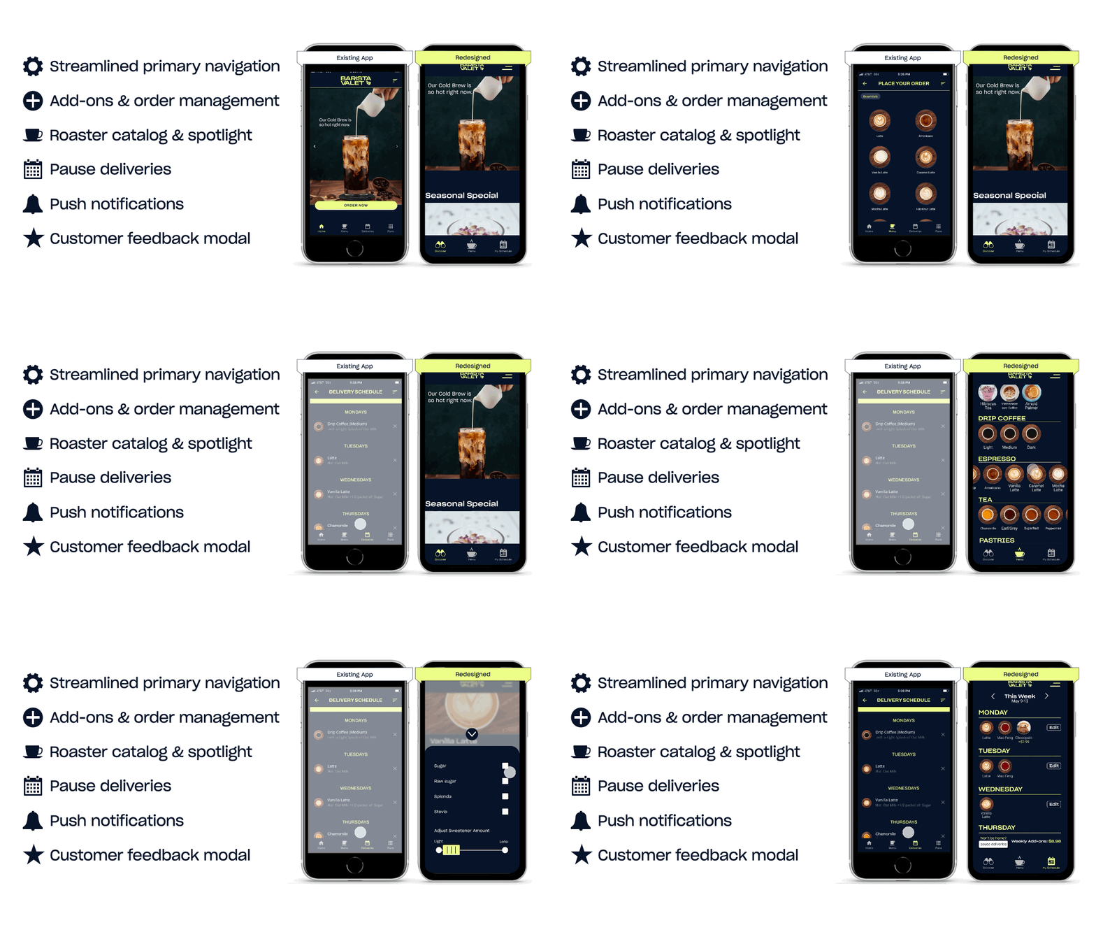
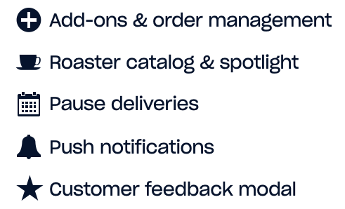
A redesigned Barista Valet, which proved on average 43% more usable than the previous version. Our redesign included the following features, (which you can see more in depth below, in the Design & Testing phase of our process).
For more views of before & after, see below.
Our Process
We Started With What We Believed
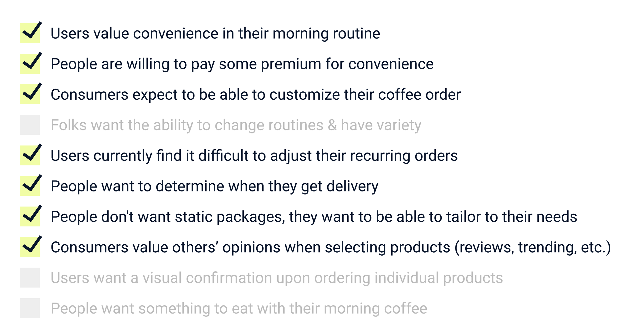
Based on initial business research and what we learned from the Barista Valet team, we hypothesized that coffee drinkers want an affordable and convenient way to get their morning coffee and breakfast. Our assumptions included:
Leading us to wonder, how might we provide users a convenient way to enjoy their favorite food and beverages in the morning?
Validating Our Beliefs
To substantiate our assumptions, we conducted 6 user interviews with existing or churned Barista Valet customers, as well as 5 propsective customers (coffee lovers & existing subscription holders).
We also sought broadly to validate Barista Valet’s value proposition and understand their customers’ wants, needs, and pain points.
What We Heard
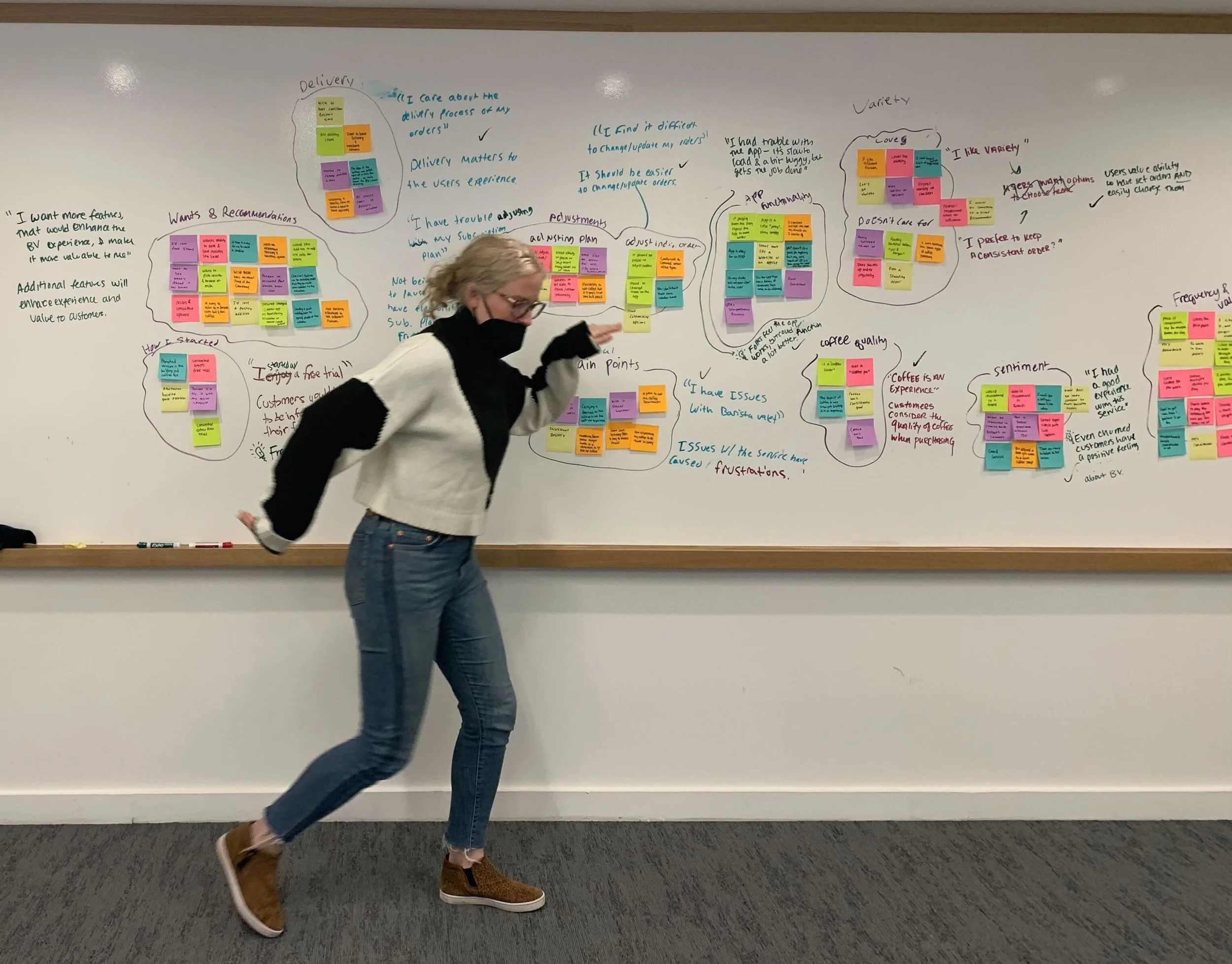
Synthesizing What We Heard
We used affinity mapping to distill our user interview observations into key insights.
What We Learned
Among those insights, we found…
What We Validated
We circled back to our original assumptions to revisit what beliefs were validated through our research, versus some that were not substantiated.
Refining Our Focus
Armed with learnings from our research, we used a few tools to deepen our understanding of the Barista Valet customer and their experience.
Persona
We created a fictionalized representation of a Barista Valet user, Stephen, who reflects the needs of our target audience. Stephen was our north star in creating solutions, designing, and iterating on our concepts. Below is an abbreviated version of the full persona.
User Journey
We then increased our understanding of Stephen by walking through, step by step, his “typical” experience using Barista Valet.
Full User Journey
(our target areas of opportunity highlighted)
Target Pain Points
Service Blueprint
We also created a service blueprint, that outlined the actual processes of Barista Valet’s service, and the actions Stephen takes while engaging with those processes.
The user journey map and service blueprint were essential to understanding the existing flows and crystalized opportunities for improvement within Barista Valet’s service and or, specifically, mobile app experience.
Revised Problem Statement
Ultimately this all culminated in an updated problem area for us to keep centered as we moved into design:
How might we create a convenient delivered cafe experience that saves users’ time, without compromising quality?
Design Studio: Sketching & Concepting
With clear focus on our user and their needs, we started by ideating features that would be the most valuable for Stephen. We used a prioritization matrix and a Must/Should/Could/Won’t framework to distill our many features down to only the most critical.
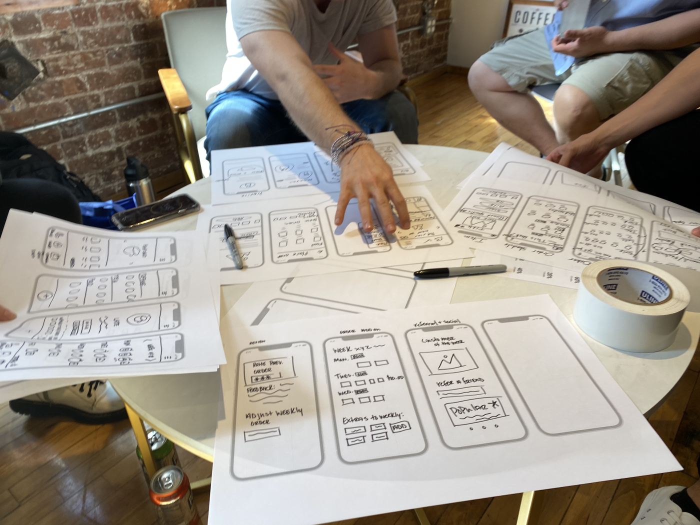
We then brought these features to a collaborative design studio, with the Barista Valet team. This process helped quickly visualize features in different ways, using the best parts of each pitch to converge on our V1 redesign.
Some of the most exciting outcomes of our design studio were realizing things we initially thought were a “must,” weren’t actually practical or necessary. For example, Product Reviews.
The final set of features that would be incorporated into our converged designs were:
Our Prototype
Click around above, or take a look at some key tasks below!
What We Changed & How It Performed
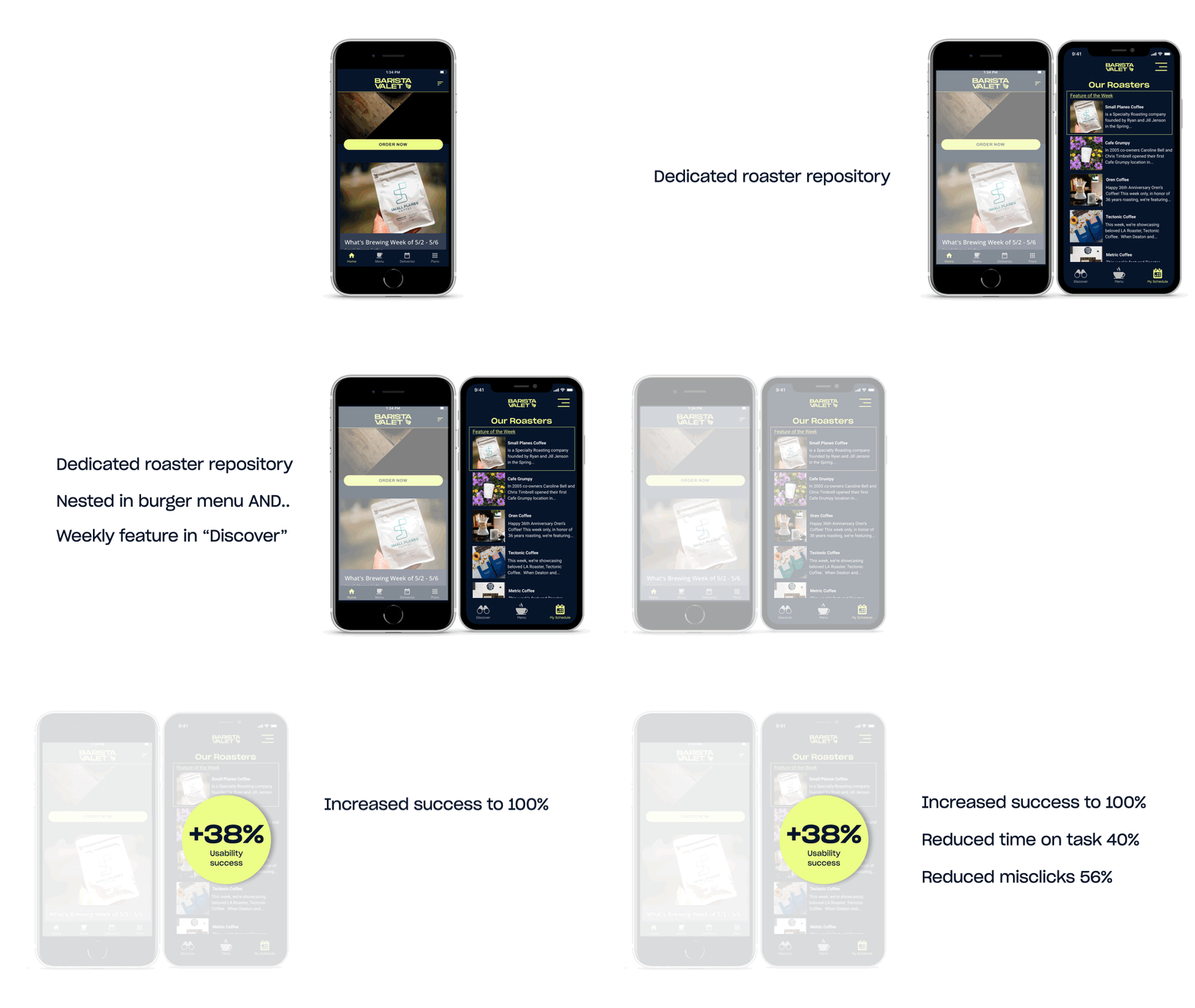
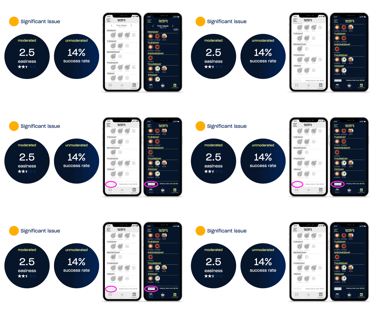
Below are each of the changes we made from the original designs and how these changes increased usability across all three tasks assigned to participants.
What We Changed, A Recap:
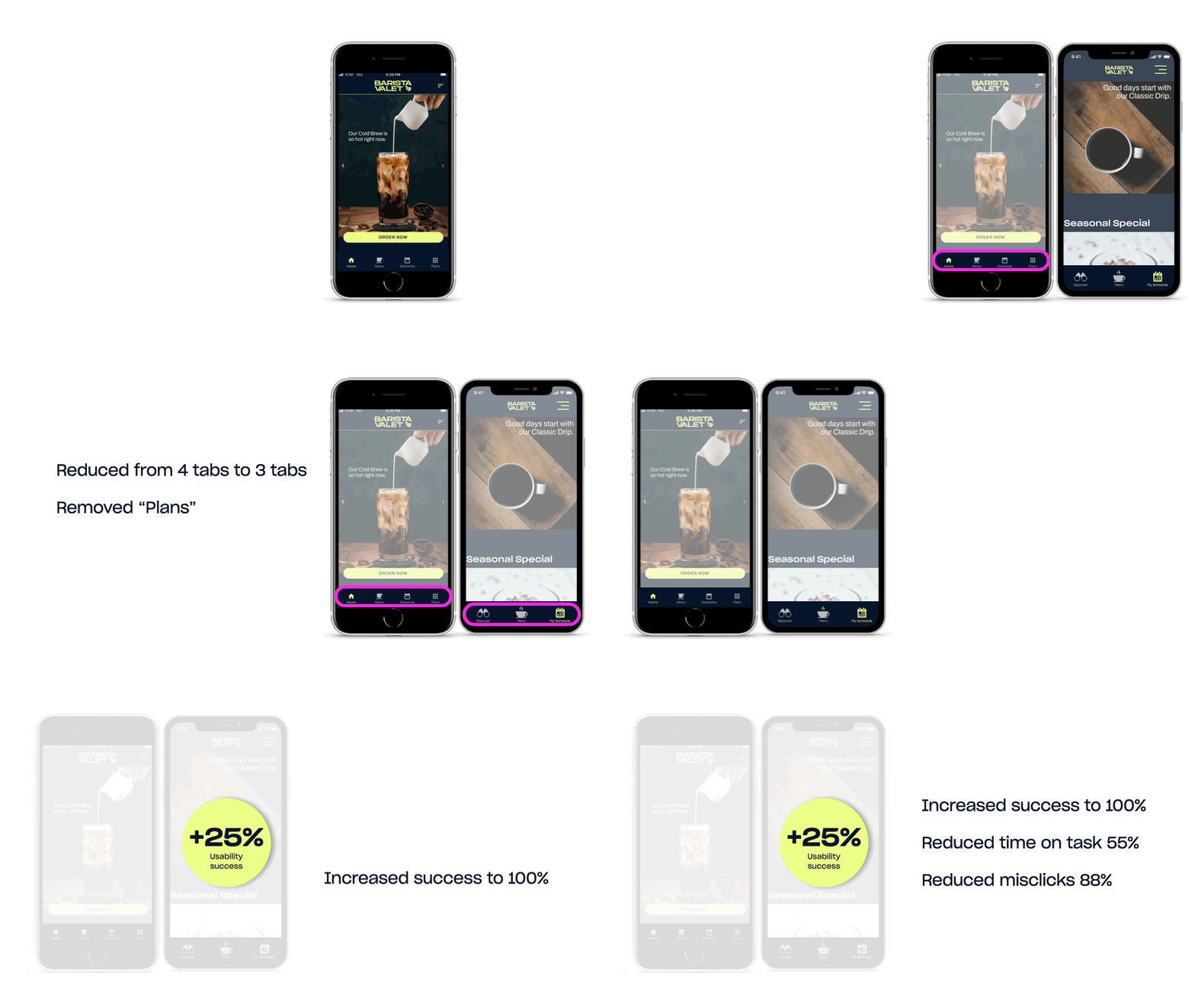
How it Performed: Streamlined Primary Navigation
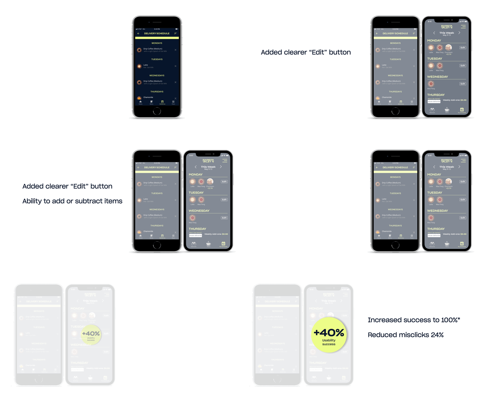
How It Performed: Order Management Flow
How it Performed: Roaster Catalog
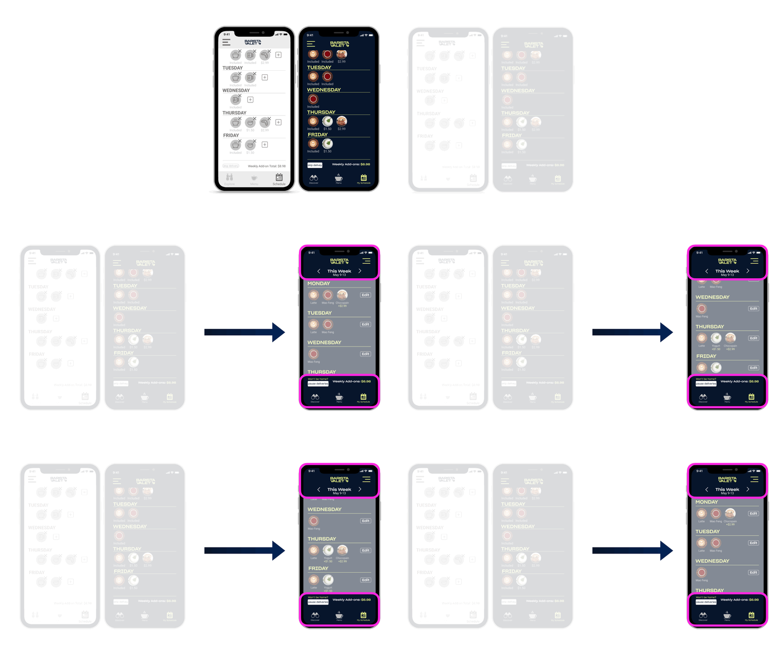
How It Performed: Pausing Deliveries
Pausing deliveries, however, a brand new feature, proved to have issues throughout testing.
Many participants had trouble finding the button and the language didn’t totally resonate.
So, following our last round of testing, we made some final adjustments. We made the call to action button and weekly total sticky to the bottom of the screen, along with the weekly navigation sticky to the top, so users know what week they are looking at at all times.
Untested Features
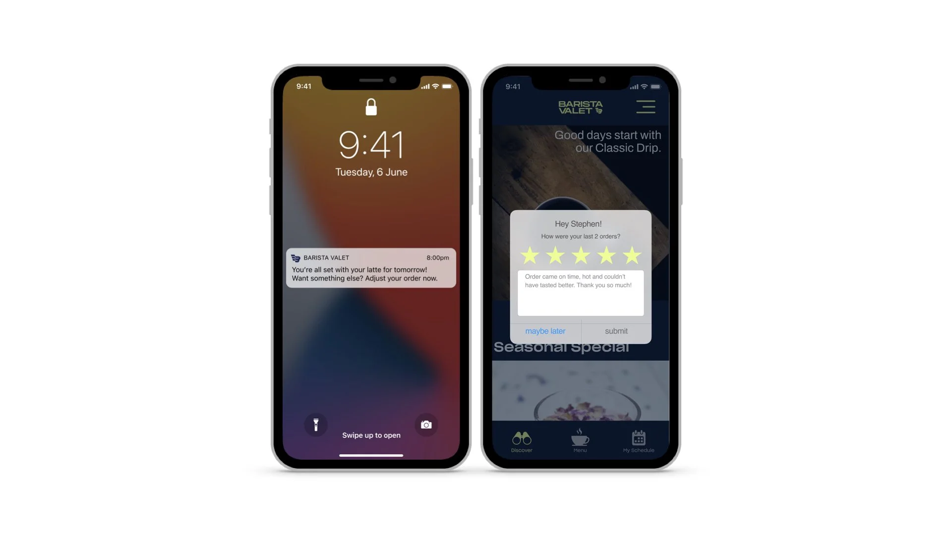
Two final features we developed were push notifications and a customer feedback modal. Barista Valet currently has notifications for when orders arrive, but our research indicated users often forget to adjust their order — so a reminder daily or weekly would be a tremendous benefit.
The customer feedback modal will allow Barista Valet to get regular insight into customer sentiment and hopefully solve problems or frustrations proactively, rather than reactively after churn.
These screens were not part of our testing, so as you’ll see below, we do recommend additional testing for these features and the revised delivery pause flow.
So, What Next for Barista Valet?
Our strongest recommendation is to conduct at least one more round of user testing to validate the final design and some of the untested features (push notifications, feedback modal). Arguably the push notifications and feedback modal could go through much more validation and testing through the UX process to understand if, when, and how customers prefer to engage with these features.
Based on our research, some additional features to consider down the line that didn’t make it into our essential redesign include:
Incentives and/or some sort of loyalty program
Delivery on weekends
Delivery to offices (rather than residences)
Delivery tracking
We’re excited to see the results of this redesign, particularly in how they impact engagement and retention of Barista Valet’s customers.
With greater ease of use, more products in the pipeline, and greater delivery flexibility, any day is now a great day to enjoy Barista Valet.
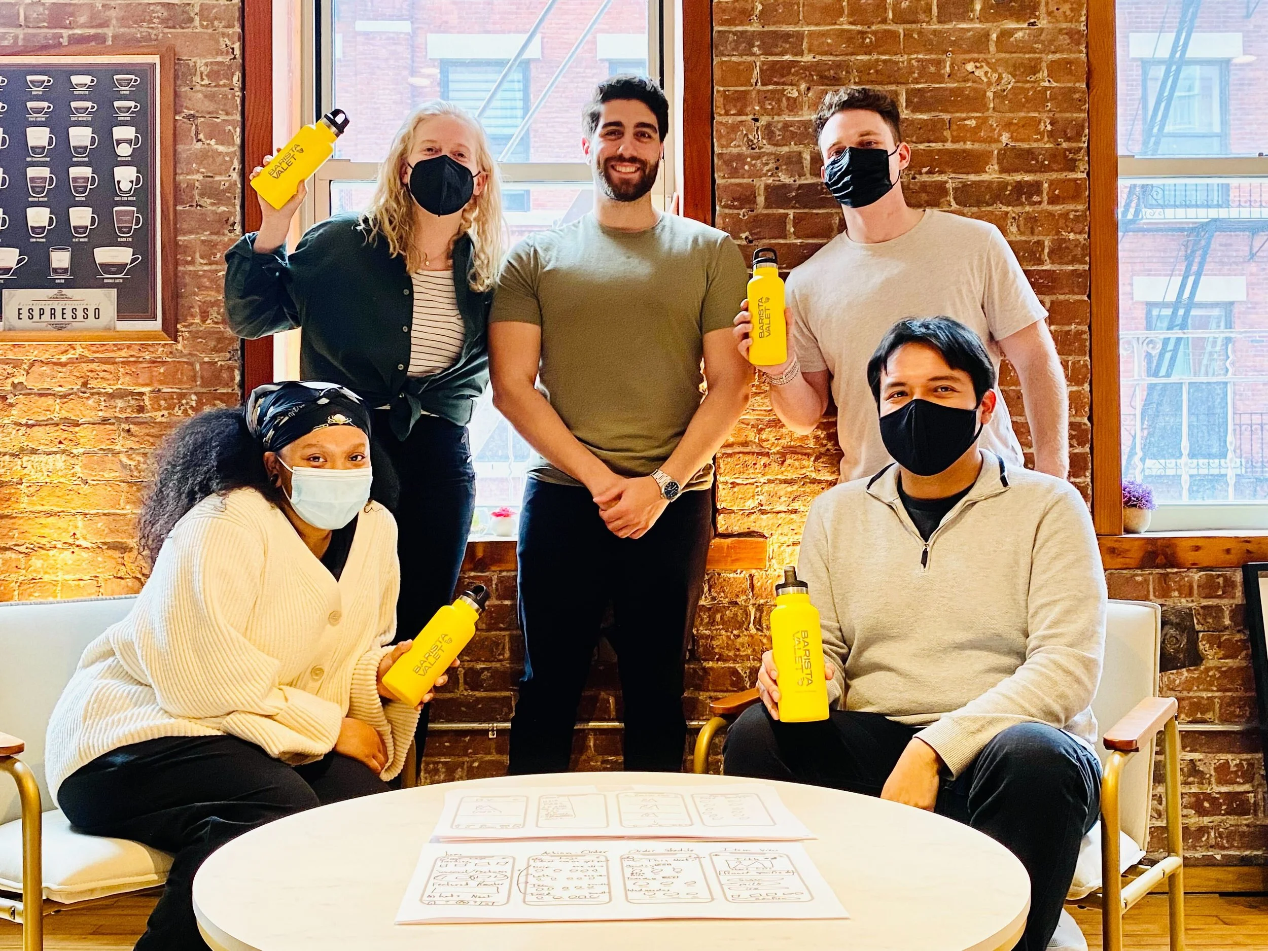
The Dream Team: Nef Bourne, Erin George, Jordan Cantor, and Brandon Cespedes with client, Chris, center.

