For Clear Skin, Clean Slate
App for skin health education and healthy habit-building, accessible via mobile and wearables. Create routines, track daily progress, and learn the latest wellness trends.
Project Overview
Our goal was to understand how people care for their skin, the pain points they experience trying to maintain healthy skin.
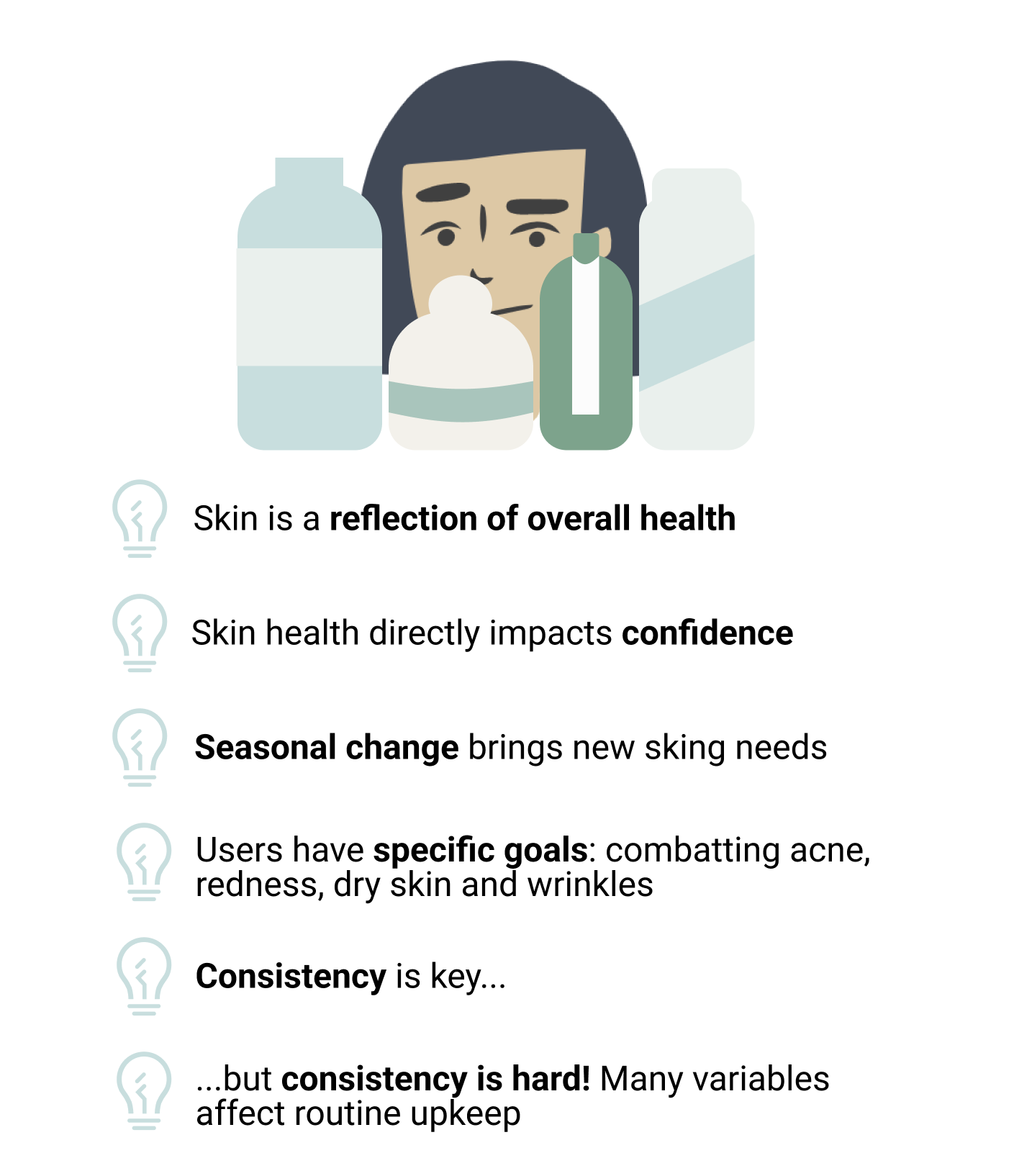
Through user interviews we learned that skin is a reflection of one’s overall health and is deeply tied to confidence. Having a consistent skincare routine is essential to maintaining skin health, but consistency is hard!
We conceived, then tested, a solution that provides people skincare education and a way to manage their skincare routine all in one mobile & wearable app.
My role: UX Designer
Duration: 14 days
Project Status: Complete, April 2022
Methods used: Business Model Canvas, Screener Survey, User Interviews, Affinity Mapping, User Persona, User Journey, Feature Prioritization, Sketching & Design Studio, Style Guide, Wireframing, Prototyping, & Usability Testing
Introduction to the Problem Space
We exercise to improve our heart health, and do puzzles to sharpen our mind… shouldn’t the body’s largest organ get the same care and attention? That’s right, our skin! It’s no wonder many companies have already capitalized on this space; the skincare products market was valued at over $140 billion in 2020.
However, everyone’s skin is different and has different needs. With such an overwhelm of products and advice, folks don’t know the fundamental factors that affect their skin health — nor what products might work best for their unique skin type.
The Challenge
We hypothesized that folks need beauty tips that educate them on how to better take care of their skin.
How might we enhance users’ skin health through educational tips that are tailored to their skin types, habits, weather conditions, and more?
Our Solution
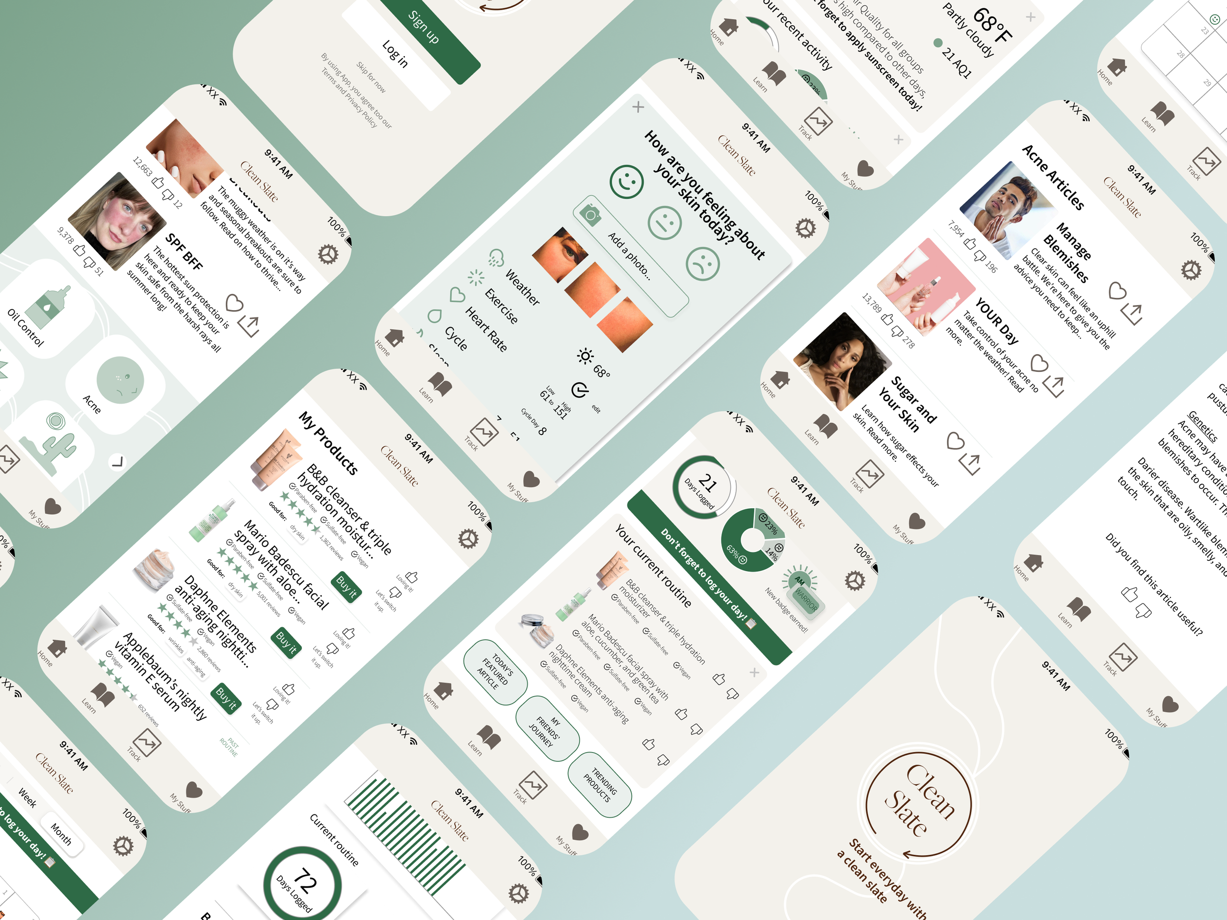
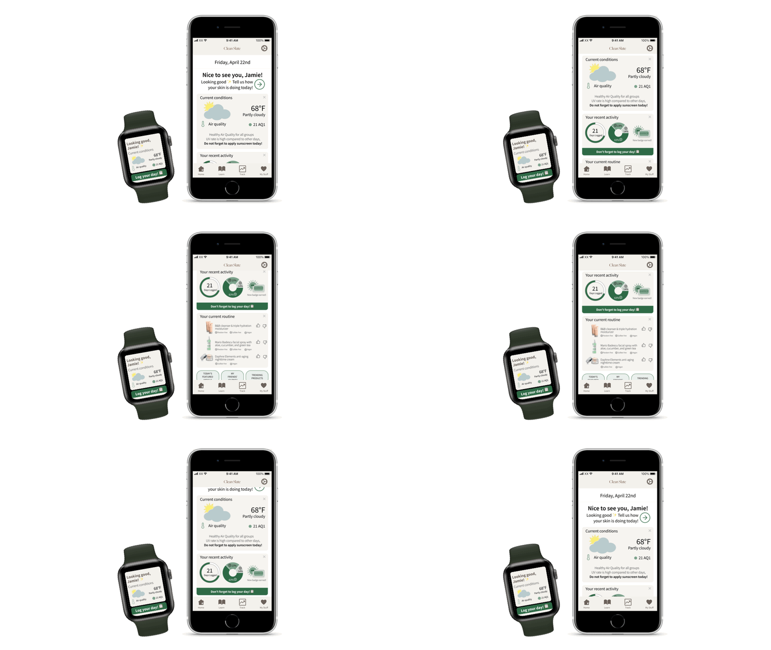
Clean Slate: manage your skincare routine and a skincare education tool all in one mobile & wearable app. Notifications provide reminders, alerts, and daily affirmations to help users stay on track.
Clean Slate brings intentional moments of everyday care by delivering a personalized experience.
Our Process
We Started With What We Believed
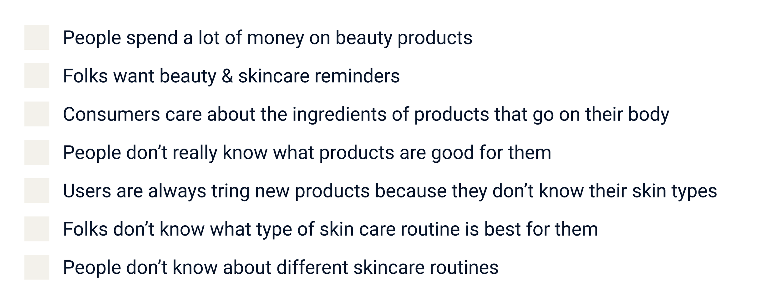
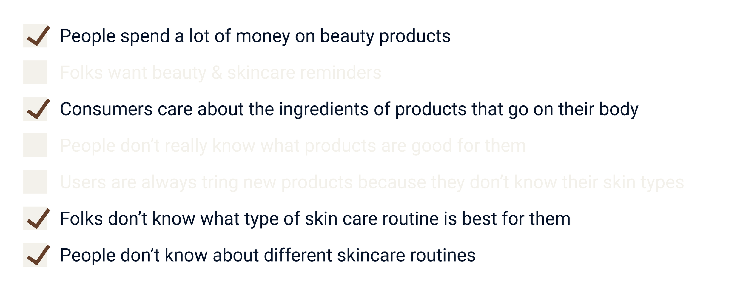
Based on topic mapping and an initial brainstorm about our problem space, we had a few beliefs we wanted to validate with research. Our assumptions included:
Leading us to wonder, how might we provide people relevant beauty tips everyday based on their personal skin types, habits (sleep, menstruation, etc.), the current weather conditions, and more?
Validating Our Beliefs
To substantiate our assumptions, we conducted 5 user interviews with folks who fit our target audience; those interested in skincare and skin education, who are open to incorporating new elements into their routines.
What We Heard
Synthesizing What We Heard
We used affinity mapping to distill our user interview observations into key insights.
What We Learned
Among those insights, we found…
What We Validated
We circled back to our original assumptions to revisit what beliefs were validated through our research, versus some that were not substantiated.
Refining Our Focus
Armed with learnings from our research, we used a few tools to deepen our understanding of the our target audience and their experience.
Persona
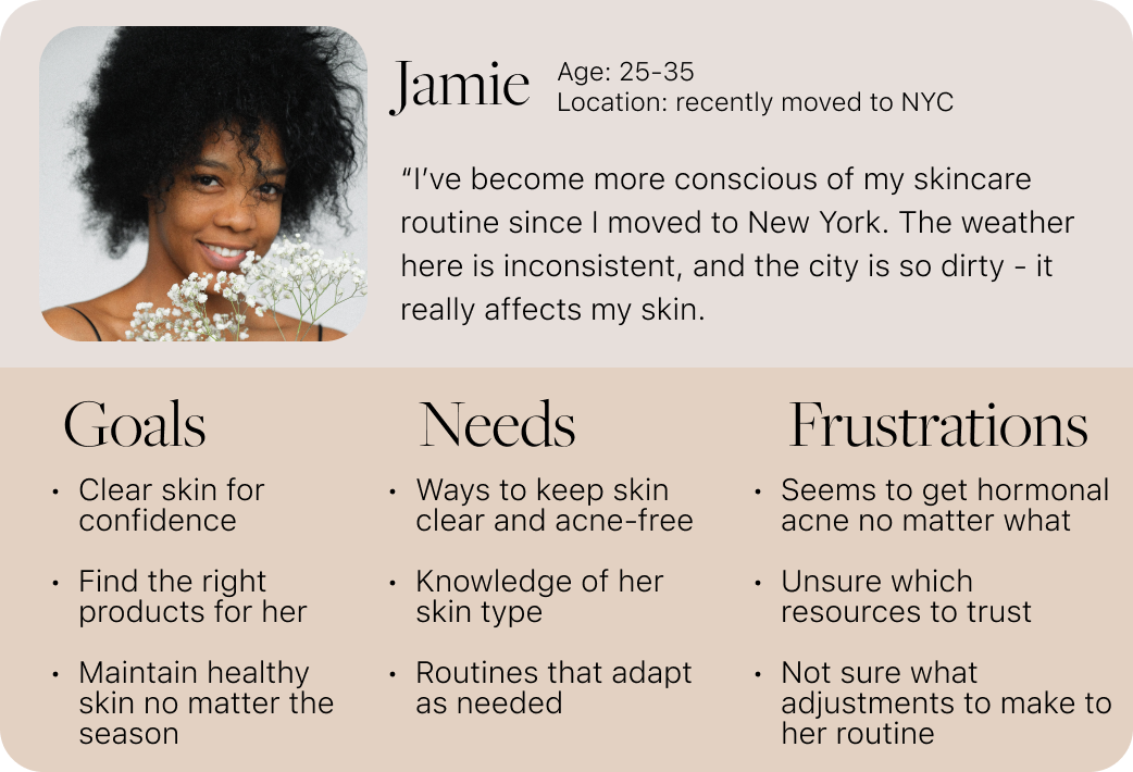
We created a fictionalized representation of our user, Jamie, who reflects the needs of our target audience. Jamie was our north star in creating solutions, designing, and iterating on our concepts. Here is an abbreviated version of the full persona:
User Journey
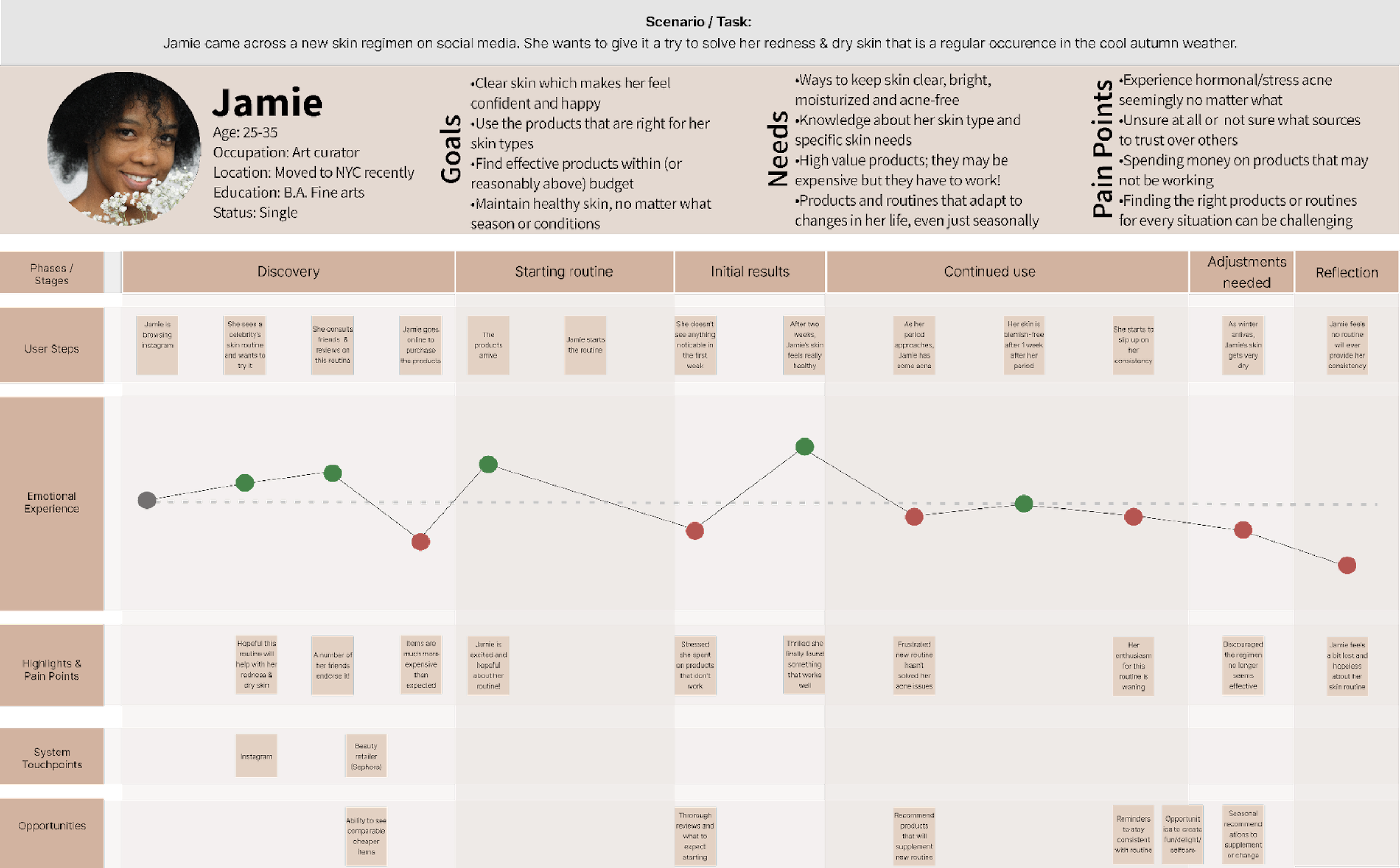
We deepened our understanding of Jamie by walking through, step by step, a typical experience she has with a new skincare routine. This allowed us to see clear opportunities for solutions.
Full User Journey
Target Opportunities
The user journey map was essential to understanding the existing flows and crystalized opportunities for us to focus on with our solution and designs.
Revised Problem Statement
Ultimately this all culminated in an updated problem area for us to keep centered as we moved into design:
How might we enhance users’ skin health through educational tips that are tailored to their skin types, habits, weather conditions, and more?
Design Studio: Sketching & Concepting
Following our research, we started by ideating features that would be the most valuable for Jamie. We used a prioritization matrix and a Must/Should/Could/Won’t framework to distill our many features down to only the most critical.
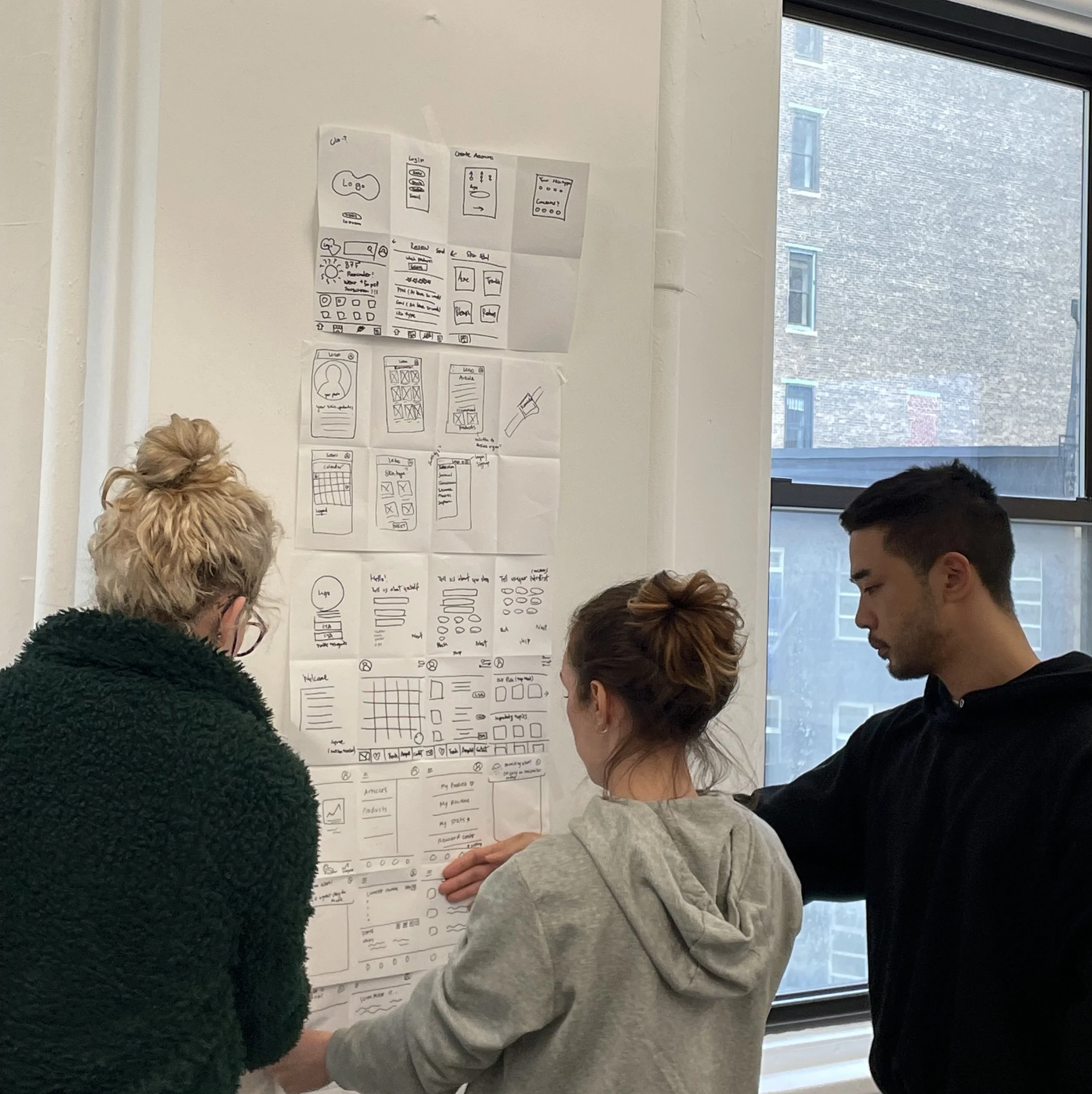
We then brought these features to a collaborative design studio, where each teammate rapidly sketched and pitched low-fi wireflows. This process helped quickly visualize features in different ways, using the best parts of each pitch to converge on V1 product.
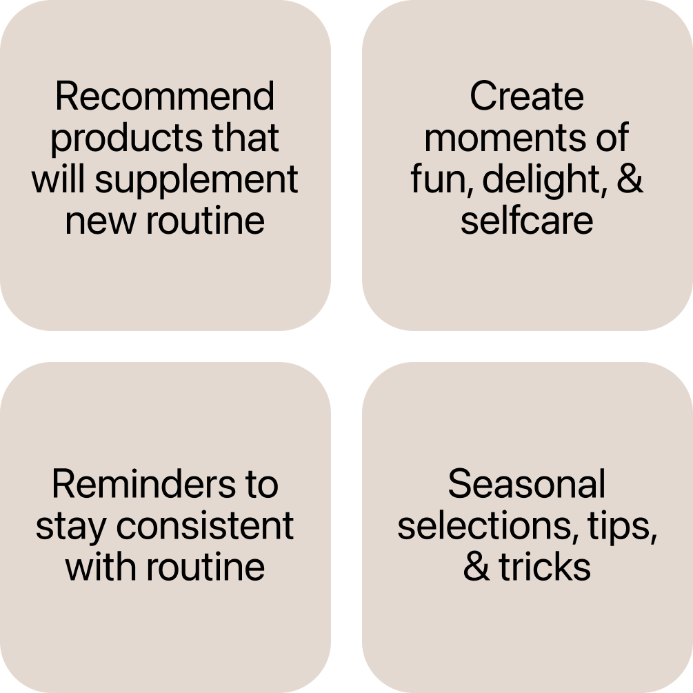
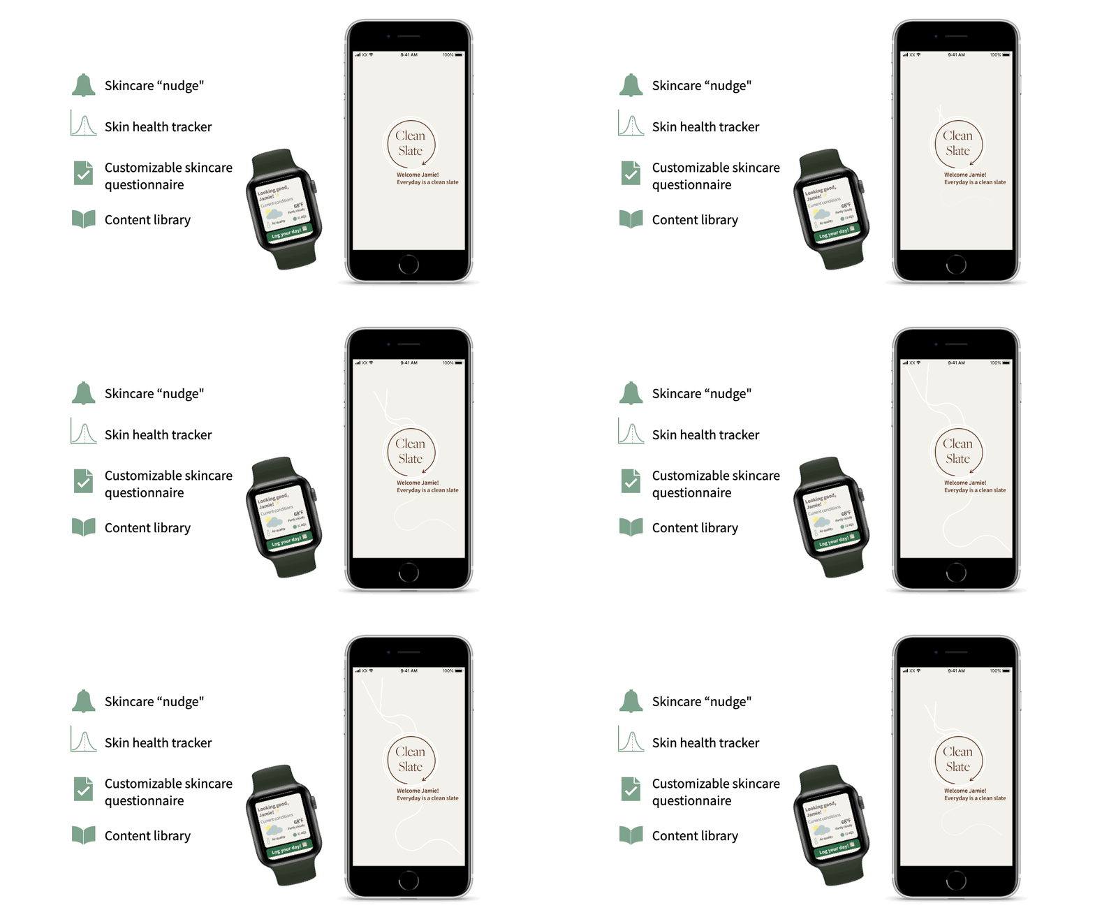
The final set of features that would be incorporated into our converged designs were:
Our Prototype
Moving through different fidelity iterations…
How Our Designs Performed
Initial Designs
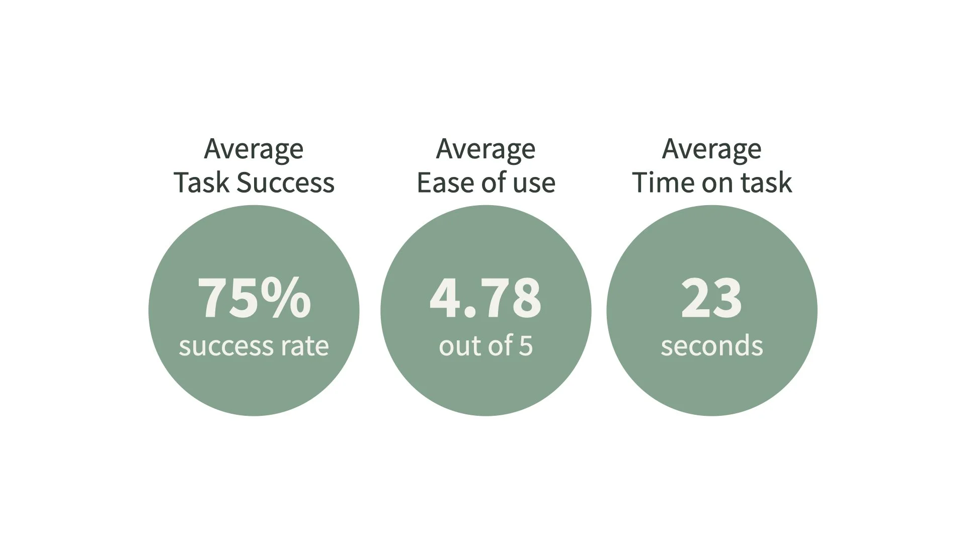
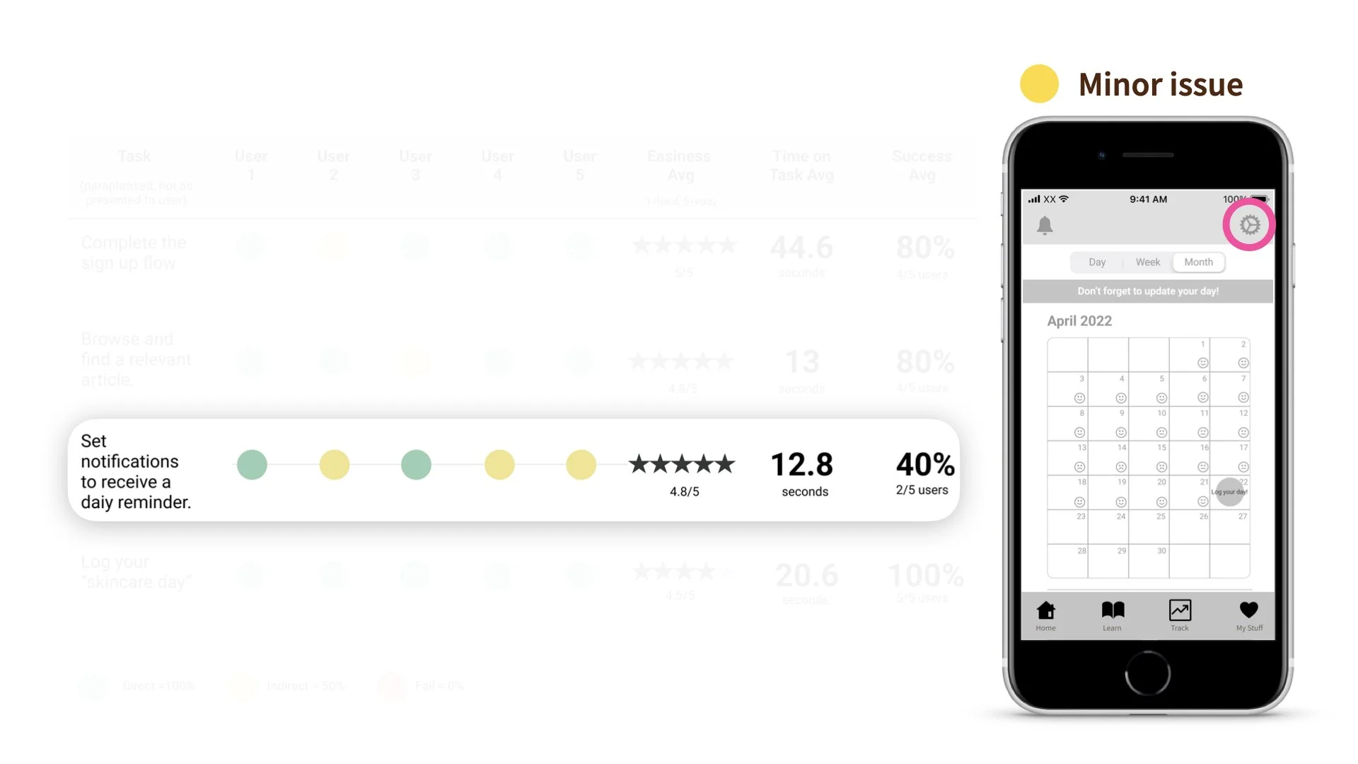
To understand if our concept resonated with audiences and worked as intended, we did a remote moderated usability testing of our mid-fidelity prototype with 5 participants in our target audience. We gave participants 4 tasks to complete, evaluating the success average per task, easiness, and time on task:
Adjusting notifications settings was the most difficult task, though participants still rated this functionality extremely easy and were able to complete the task.
Therefore, we deemed this a minor issue, and decided not to take immediate action. We were curious to see if the problem persisted with a broader sample of participants.
However, there were some anecdotal insights from our participants that we sought to focus on moving into our high-fidelity prototype:
Our Final Designs
We used the exact same remote moderated format to conduct another round of user testing with a new set of 5 participants.
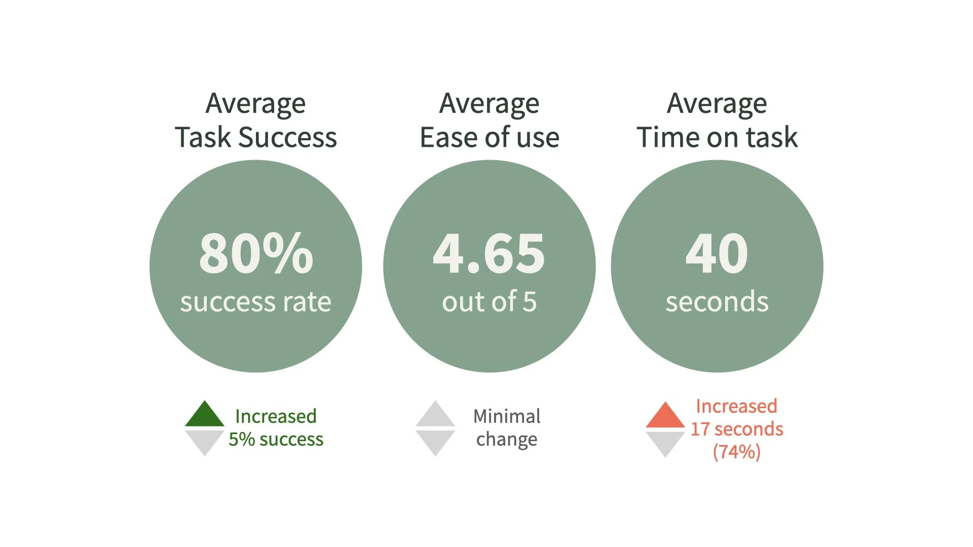
And the results were very similar, though notably time on task increased. However, ease and success were both comparable to our first round of testing.
We believe this reflects the transition from placeholder copy to actual copy — especially in our sign up flow. We added a great deal of text (intro, gender identity) which participants took the time to read.
One of our biggest learnings for the future is to build out our mid-fi copy a bit more, to have a more accurate baseline going into our hi-fi.
We feel confident in this case though, the increase in time on task in this case isn’t a reflection of poor user experience — in fact our easiness and success scores indicate strong usability.
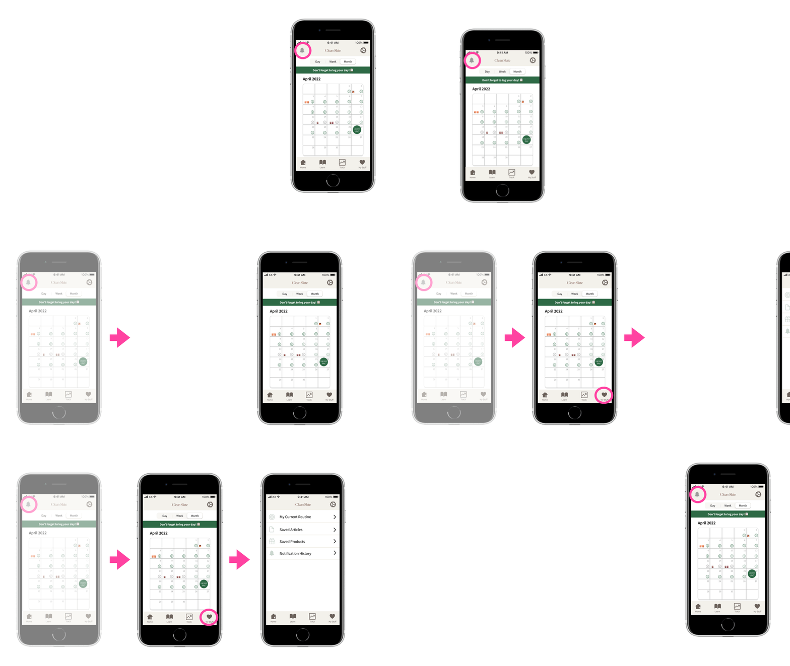
Notification settings did continue to be an issue, so following our second round of testing, we did adjust the UI. Most participants’ instinct was to check the bell icon where the notification history lives. We decided to remove the bell icon and nested the notification history in the “My Stuff” tab.
We do believe additional testing would be valuable to to discern “My Stuff” from “settings” — but think this first change will have a big impact on usability.
What Next for Clean Slate?
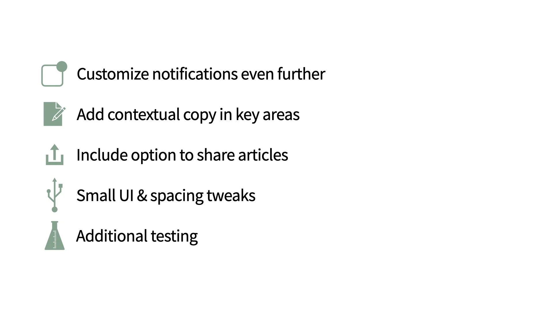
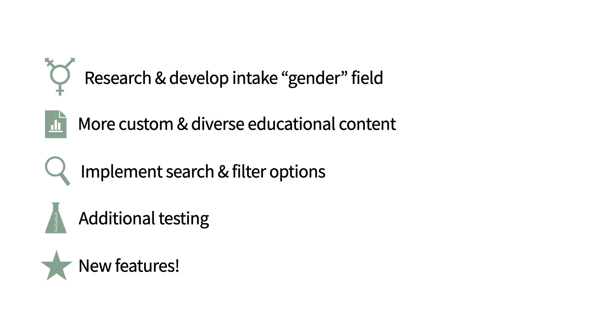
Through our process, we demonstrated the value of our concept and believe the MVP will be ready for implementation after some additional testing. In future iterations, we recommend the following:
Once the MVP is ready, there are a number things we want to monitor moving into launch, to determine if we’re on the right track. 3 of the most critical are:
Adoption — does our value prop resonate with customers? We would see this play out in signups and signup conversion.
Engagement — our app is all about building routine and an active customer is regularly engaging with our product. We would want to monitor how often users are logging in, and how often they are recording their day.
Retention — we’ve defined an active user as a customer who has logged into the app in the last 90 days. After 90+ days, they would be considered churned, and we’d want to monitor our churn rate MoM.
