Navigating New Parenthood with The Journey
A responsive website home to a community of parents and childcare experts supporting first-timers on the ups, downs, and “what the heck is this?” of new baby bliss.
Project Overview
Becoming a parent can often be as exciting as it is nerve-wracking. Our goal was to discover the pain points new and expecting parents experience — particularly around self care, mental wellness, and communities of support.
Through user interviews we learned that new and expecting parents seek connection with others who empathize with their life stage feeling isolated from their pre-baby social circles. Parents also are willing, but struggle, to adjust to the personal sacrifices they make for the benefit of their children.
My role: Product Designer
Duration: 10 days
Project Status: Complete, April 2022
Methods used: User Interviews, Affinity Mapping, User Persona, User Journey, Feature Prioritization, Sketching & Design Studio, Wireframing, Prototyping, & Usability Testing
Introduction to the Problem Space
First-time parents experience all sorts of unexpected challenges when their baby arrives and new parenthood can feel incredibly isolating. They are shy to impose on friends and family, but know they need more support.
The Challenge
Entering discovery, our hypothesis was that first time parents often focus so heavily on preparing/caring for their new child, they forget to place equal importance on looking after their own mental health.
How might we empower new parents to enrich their own wellness and address any mental health challenges as they navigate early parenthood?
Our Solution
The Journey: a curated community of verified experts, parents, and resources — because in life there is no such thing as a perfect parent, just the journey of trying to be the best parent.
Our Process
We Started With What We Believed
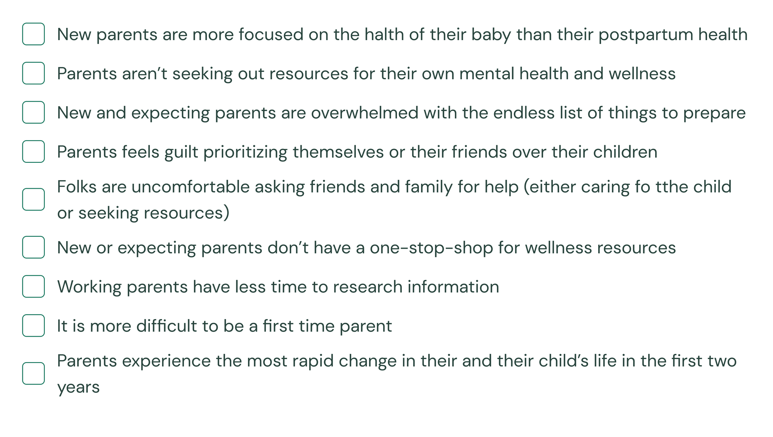
Based on topic mapping and an initial brainstorm about our problem space, we had a few beliefs we wanted to validate with research. Our assumptions included:
Validating Our Beliefs
To substantiate our assumptions, we conducted 6 user interviews with folks who fit our target audience; new or expecting parents (with “new” defined as having had their first child in the last 3 years).
What We Heard
Synthesizing What We Heard
We used affinity mapping to distill our user interview observations into key insights.
What We Learned
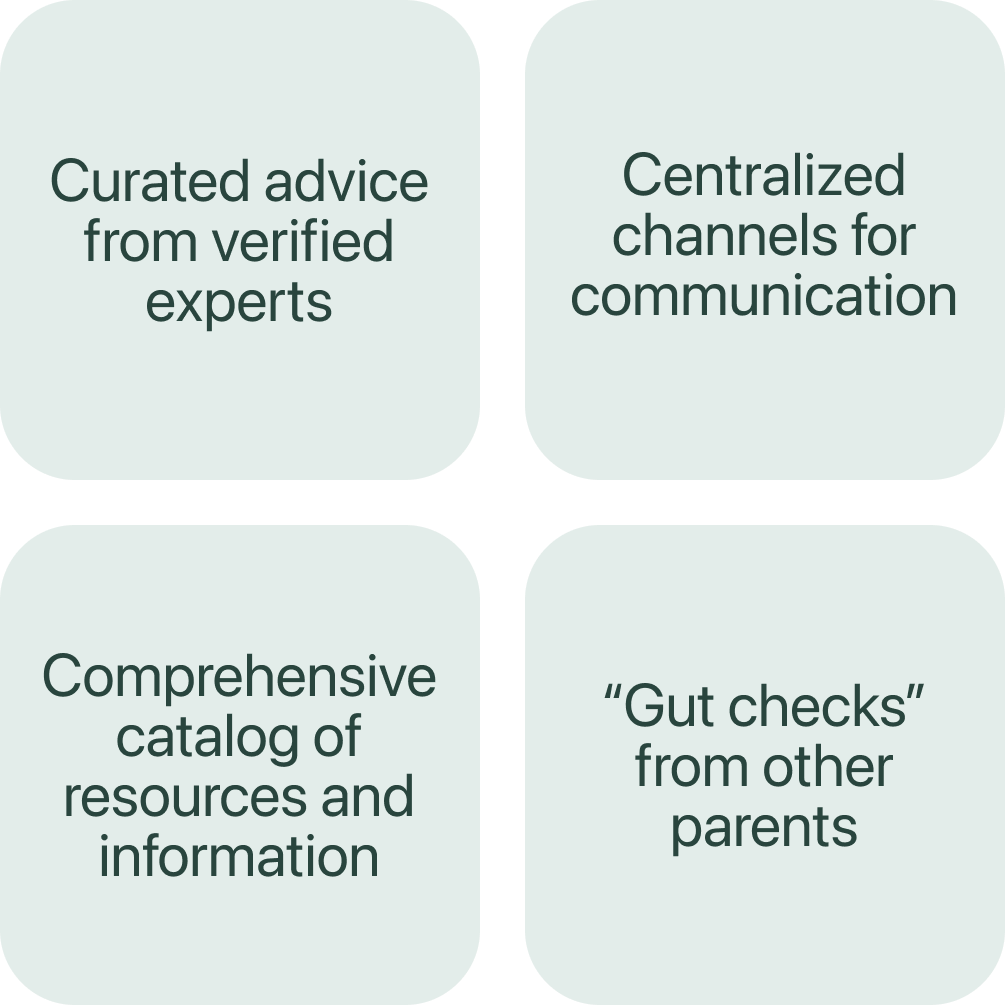
Among those insights, we found…
What We Validated
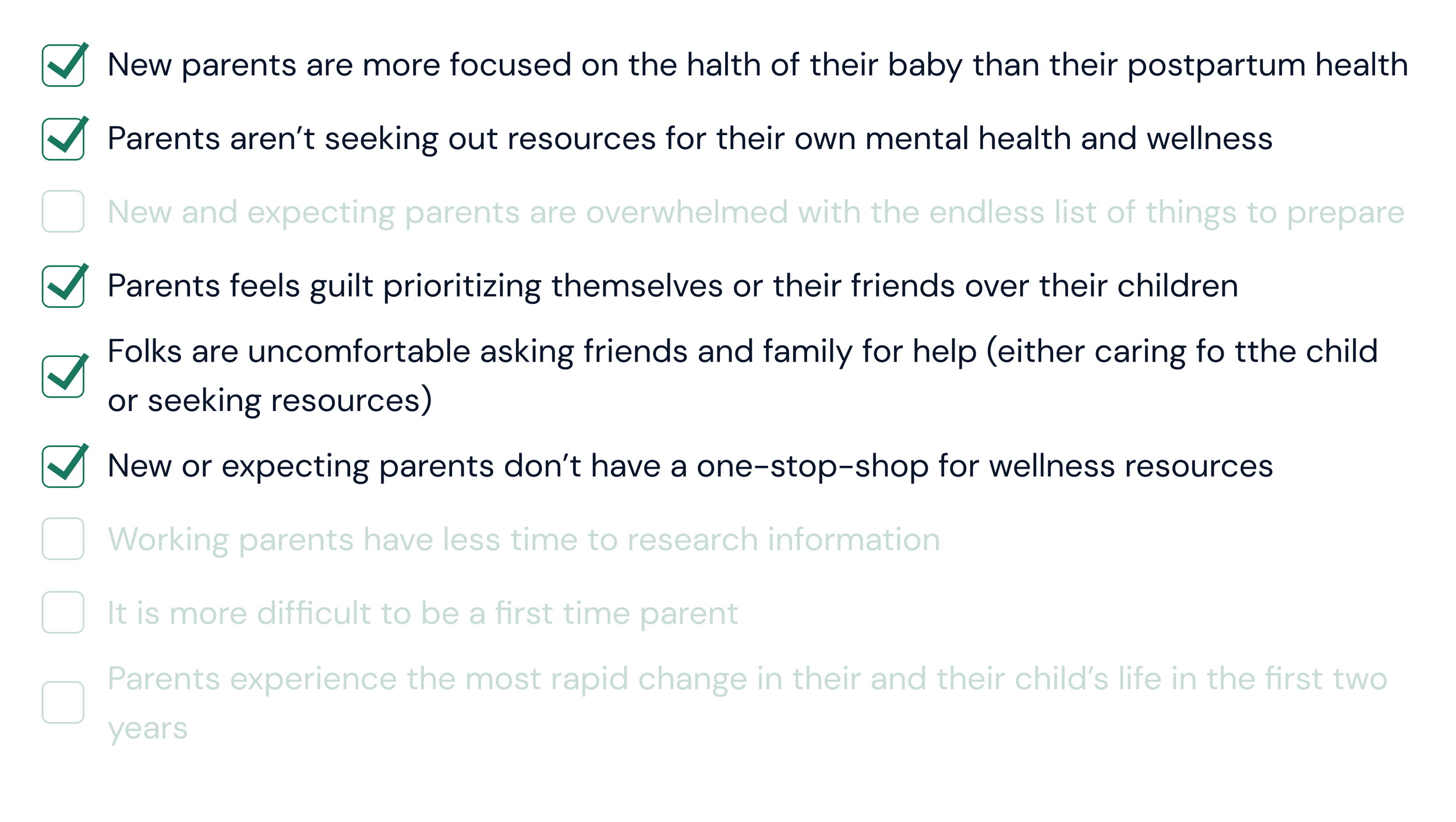
We circled back to our original assumptions to revisit what beliefs were validated through our research, versus some that were not substantiated.
Refining Our Focus
Armed with learnings from our research, we used a few tools to deepen our understanding of the our target audience and their experience.
Persona
We created a fictionalized representation of our user, Jackie, who reflects the needs of our target audience. Jamie was our north star in creating solutions, designing, and iterating on our concepts. Here is an abbreviated version of the full persona:
User Journey
We deepened our understanding of Jackie by walking through, step by step, a typical experience she has with a new skincare routine. This allowed us to see clear opportunities for solutions, summarized here:
The user journey map was essential to understanding the existing flows and crystalized opportunities for us to focus on with our solution and designs.
Revised Problem Statement
Ultimately this all culminated in an updated problem area for us to keep centered as we moved into design:
How might we provide Jackie a centralized community of parents and curated resources that can support her as a new mother?
Design Studio: Sketching & Concepting
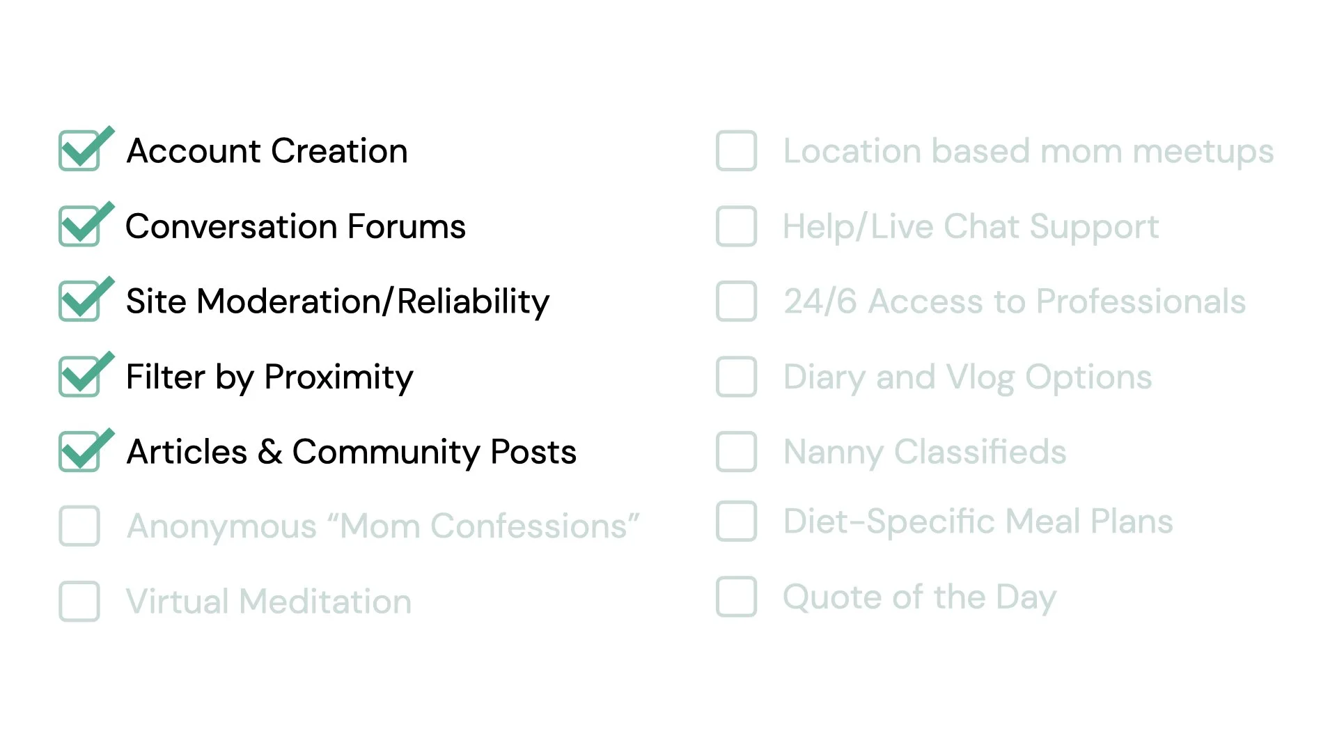
With clear focus on our user and their needs, we started by ideating features that would be the most valuable for Jackie. We used a prioritization matrix and a Must/Should/Could/Won’t framework to distill our many features down to only the most critical.
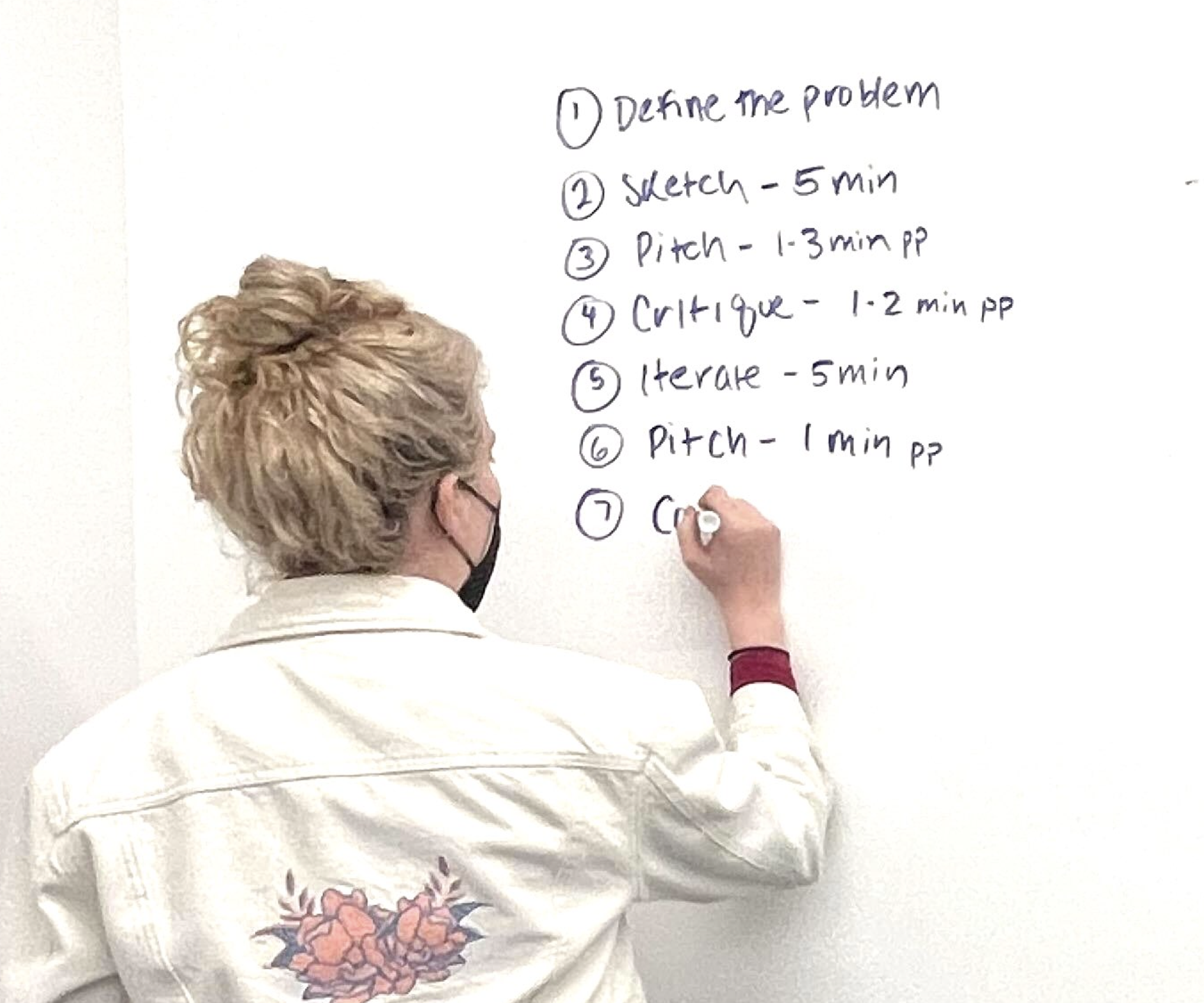
We then brought these features to a collaborative design studio, where each teammate rapidly sketched and pitched low-fi wireflows. This process helped quickly visualize features in different ways, using the best parts of each pitch to converge on V1 product.
The final set of features that would be prioritized, versus others we ideated that wouldn’t make it into our initial designs were:
Our Prototype
How Our Designs Performed
Initial Designs
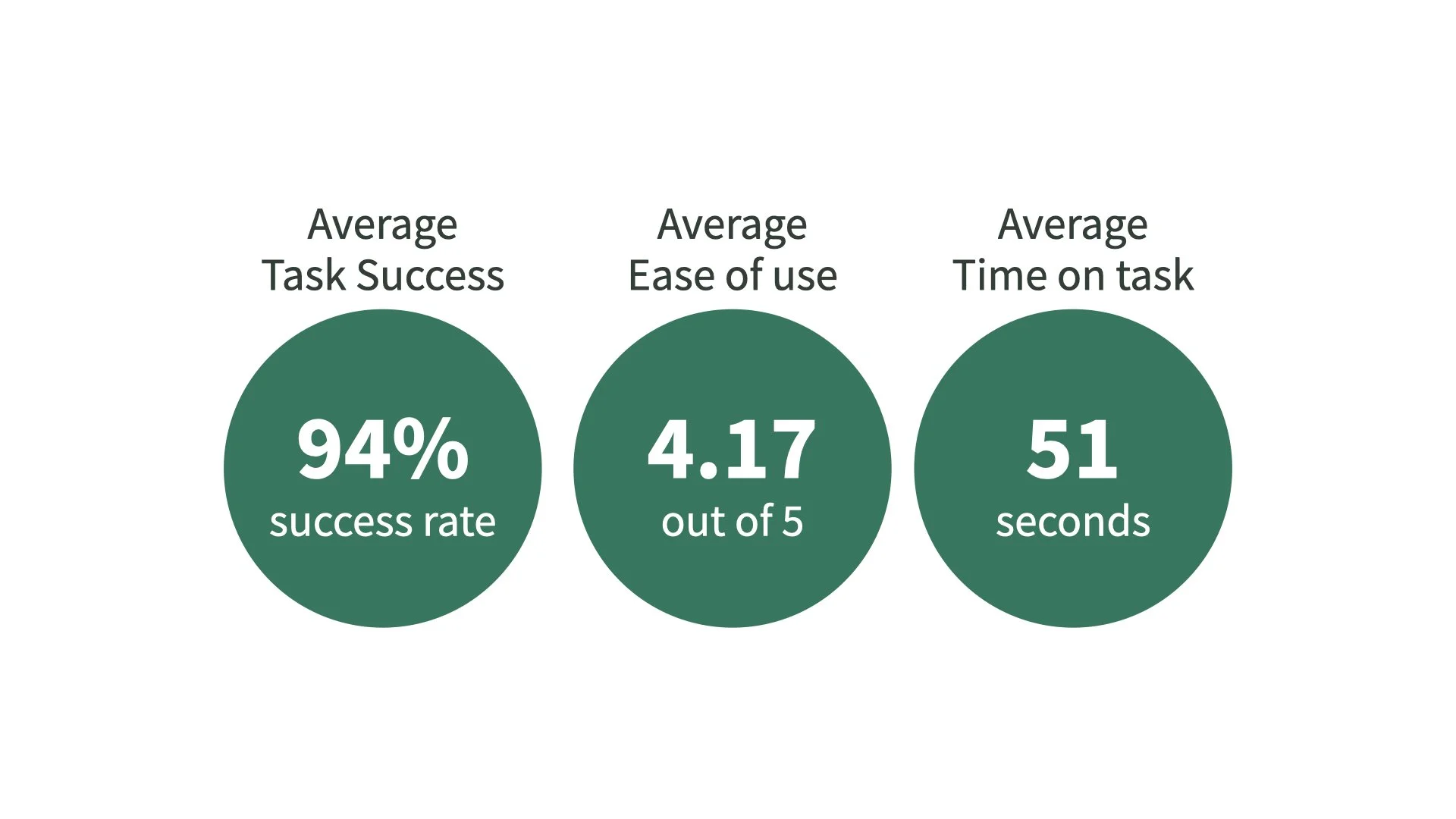
To understand if our concept resonated with audiences and worked as intended, we did a remote moderated usability testing of our mid-fidelity prototype with 6 participants in our target audience. We gave participants 3 tasks to complete, evaluating the success average per task, easiness, and time on task:
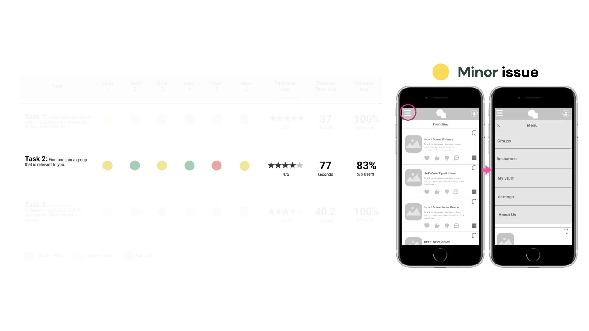
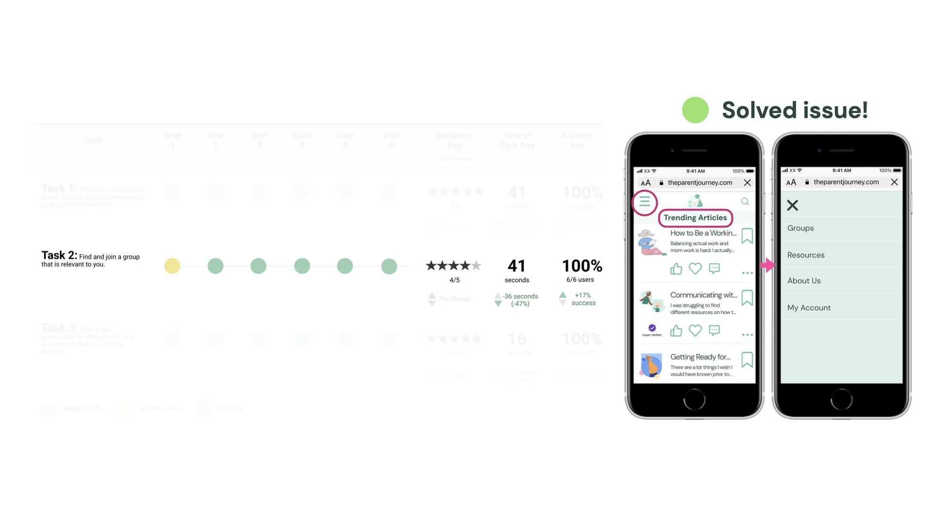
Our biggest opportunity for improvement was the flow to join a group. Participants weren’t sure where they were or what screen they were looking at, so their first instinct was to scroll rather than click the hamburger menu.
We deemed this a minor issue, as it didn’t really impede usability, but definitely wasn’t as strong an experience as it could be.
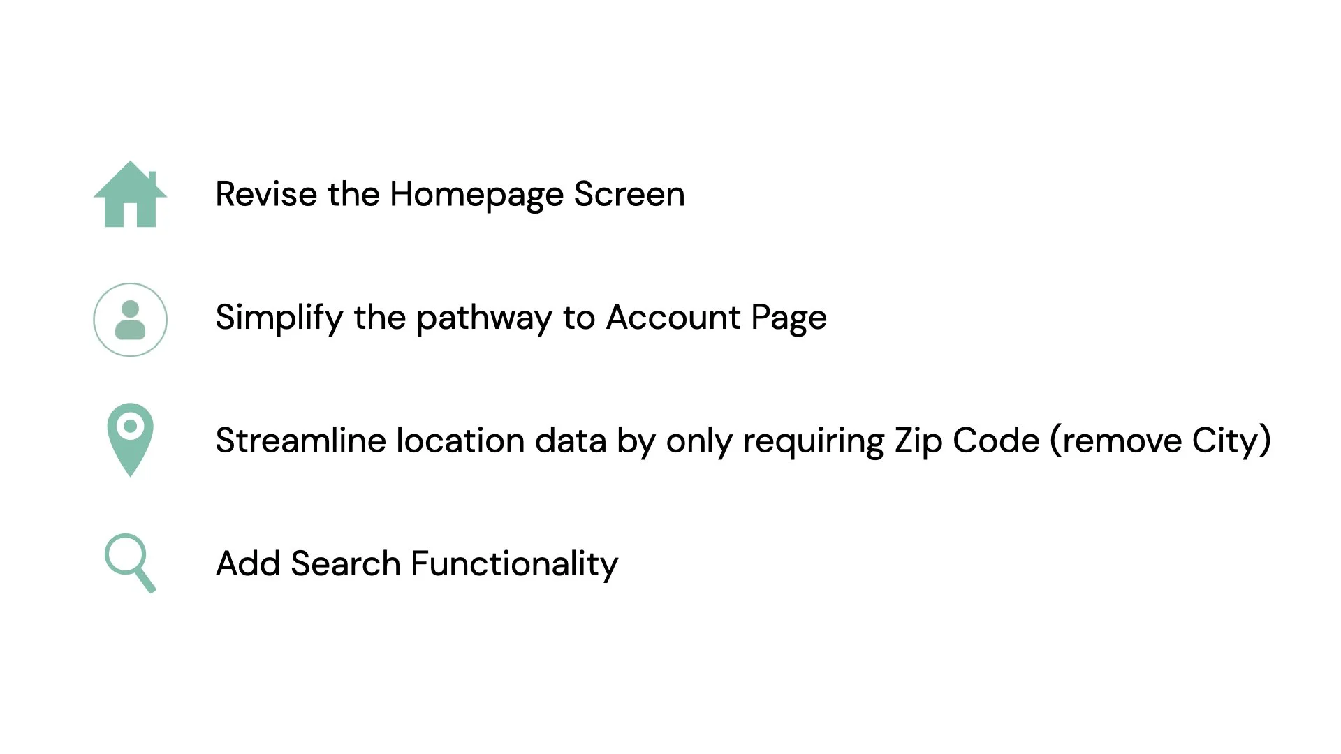
This, and other key takeaways we sought to focus on moving into our high-fidelity prototype are summarized here:
Our Final Designs
We used the exact same remote moderated format to conduct another round of user testing with a new set of 6 participants.
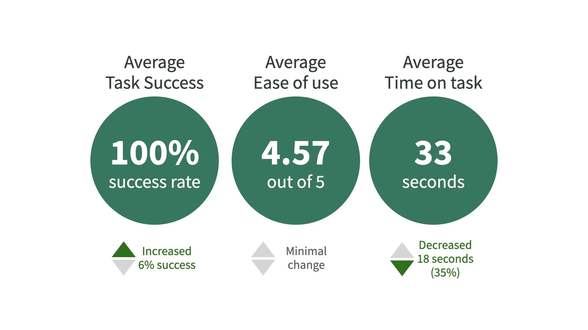
We were very encouraged by the results! You can see that easiness, time on task, and success was at or above our first round on both tasks 2 and 3.
Task 1 saw virtually no change, with only a 4 second increase in time on task — which, given the number of participants per round, didn’t indicate any issues in our designs.
We were most excited to see that with the copy and heading changes we focused on from round 1, we saw a dramatic improvement in folks’ ability to join a group — we reduced time on task 47% and increased success to 100%.
Iterating on Mobile for Desktop
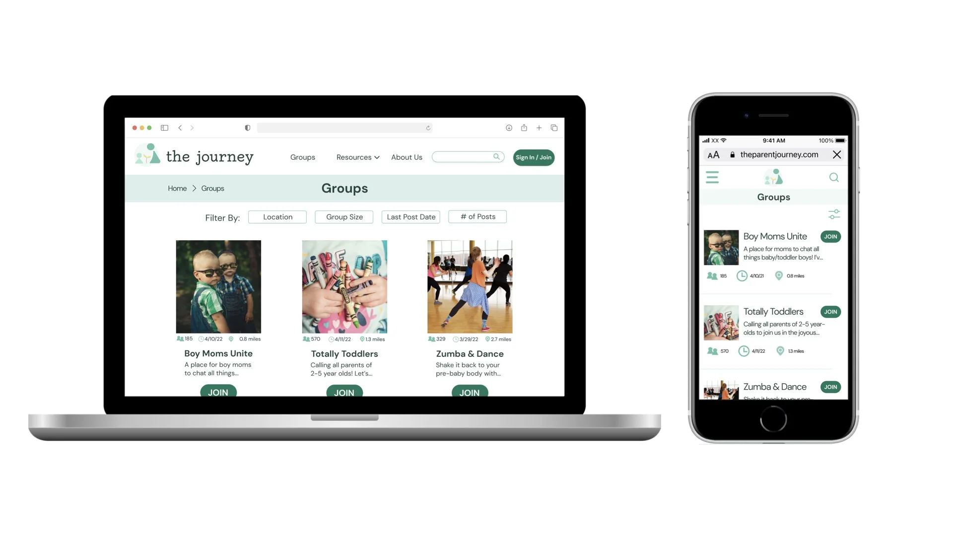
In creating our desktop screens, we wanted to achieve parity as much as possible, so the user flows did not differ much between viewports. However, the few major differences on desktop included:
An omnipresent primary navigation (rather than a hamburger drop down)
Breadcrumbs, so users know where they are on the site
Grid layout of content, rather than list view
Where The Journey continues…
Through our process, we demonstrated the value of our concept and believe the MVP is ready for implementation. In future iterations, we recommend the following:
Adding the “experts-only” toggle to the group or resource filters, in addition to the global settings
Providing more feedback to users when they take actions (i.e. confirmation after joining a group, or “changes saved” after adjusting global settings)
Revisiting features not yet prioritized; in particular, many of our testing participants desired the option to communicate directly with other parents in some sort of chat feature, outside of the public forums alone
